with manifesto
manifesto have always believed there is a better way to do digital. So when our Managing Director came to me with the challenge of designing a new visual identity for a new manifesto in just 2 weeks, I saw it as the perfect opportunity to present ourselves in a way that best reflects who we are and what we believe.
We made a conscious decision to craft a flexible new digital brand expression (with a new written manifesto serving as both a compass and a challenge), that would embody our position as the digital experience agency for changemakers.
2
week rapid design sprint

With our new strategy and a written manifesto in mind, we knew we had to create an identity that not only reflected but embraced the changing landscape in which we work, but also the people and processes we work with and the platforms we use.
It needed to have a sense of self but a lack of ego.
Team: Gem Fountain, Arjun Mahadevan, Rachael Sutherland, Akhil Morjaria, Tom Chapman, Mark Ellis, Jack Brooks
Guided by a new vision, mission and brand values, as well as our very own 'manifesto for change', we spent a day playing, researching, sharing and playing some more before aligning on a general direction of travel. This was then developed into an initial presentation to share before moving on to refining the visual identity.
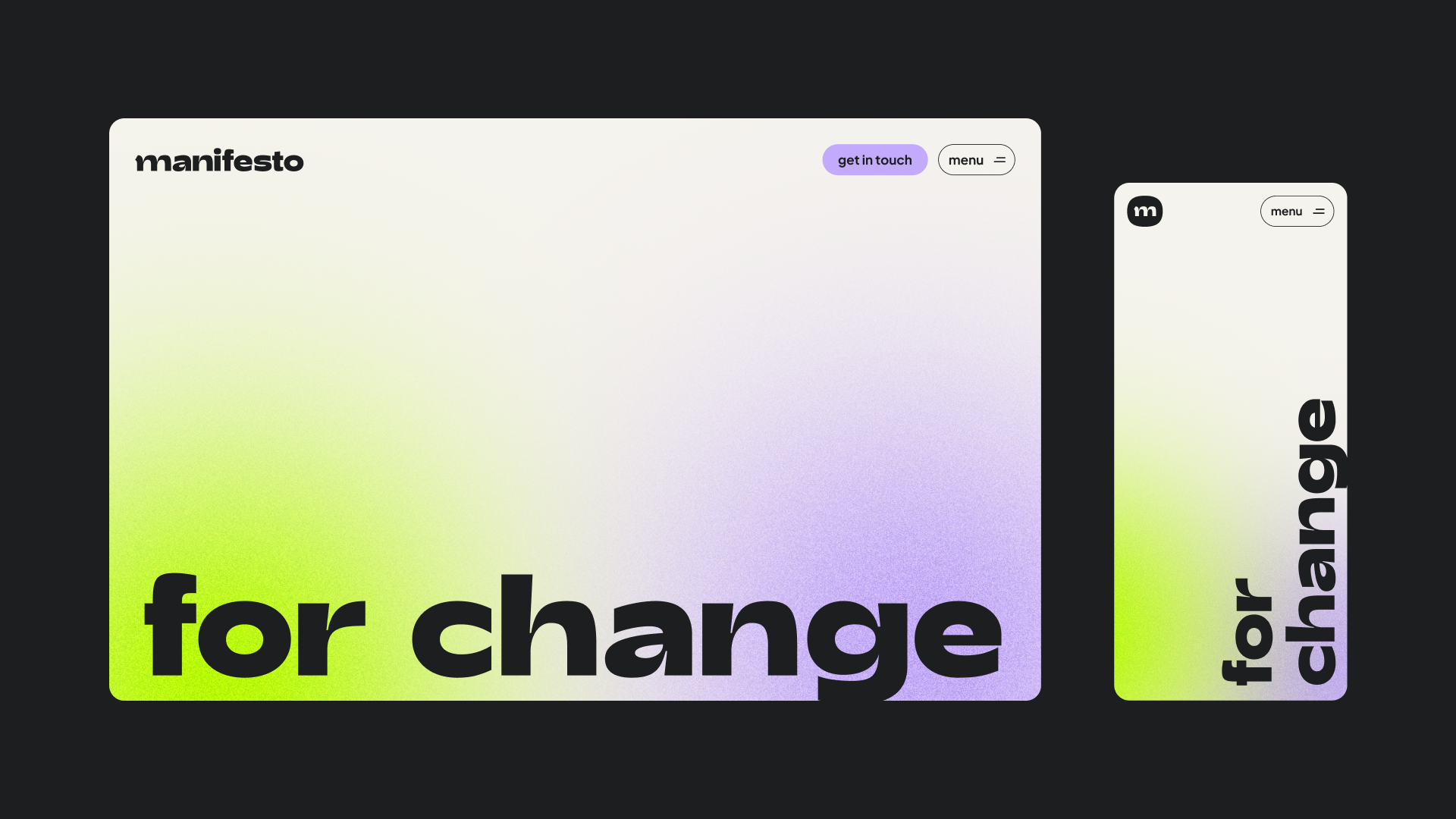
We made a conscious decision to use lowercase for the logo. More than an aesthetic decision, this represents manifesto's lack of ego as an agency. They work with, not for their clients, with the needs of people and the planet guiding decisions at all times.
Our logotype is based on the font ‘adieu’, which provides a sense of groundedness, strength and resilience, but also of openness and warmth. I played with some of the letterforms (such as adding a flourish to the m) to amp up the energy and playfulness that makes manifesto, manifesto.
The small m becomes an icon – or m’blem – a badge that conveys manifesto's personality even at small sizes.
I led the creative direction of the visual language. We needed to create a visual language that did not rely on heavy imagery or video. True to manifesto's nature as an agency, we developed lightweight, immersive digital environments that do not sit still, constantly moving to meet new challenges, inspired by the fluidity and adaptability of the natural world. They also reference the grainy texture of life - reflecting manifesto's integrity and commitment to always speak the truth.
Soft organic shapes frame out content, echoing the playful letterforms of the logo and typeface and giving a nod to the modernist movement.
It is through colour that we manifest some of the main elements of manifesto's brand personality. Our core colour is lava – a bold, strong, confident red, embodying manifesto’s fierce determination in pursuit of a better world. This is complemented by lime – a bright and vivid green, conveying a sense of energy and inspiration. Lilac – a pale purple hue – brings an element of tranquillity and wisdom to the palette, reflecting our curiosity and compassion. The world is rarely black and white, so we have opted for alternative neutral colours, an off-white and off-black chosen for warmth and clarity.
All of these elements of the brand language and more work together in harmony, providing the balance required to accurately and appropriately represent the manifesto brand, in the same way that we work with not for our clients – in partnership, and towards a better world for people, planet and society.
We’ve had some time to pause and reflect following the launch, and I’ve been exploring where manifesto might go beyond that first digital expression. manifesto's brand was deliberately developed to be open and honest, and that’s how we want to continue.
I've developed digital brand guidelines that work within our evolving, organic pattern library that is being iterated on as we test and learn with the new website. These include motion principles so that we can provide a consistent brand experience through motion and interaction.
manifesto are openly interrogating, trying new things, and inviting feedback, both externally and internally. And using it as an opportunity to learn, iterate, and grow. I've been responsible for developing a roadmap for manifesto's evolving visual identity.
I also kicked off the discovery phase of developing a sonic identity, or ‘listening logo’, so that when it comes to manifesto's brand experience, no one is left behind.

manifesto logo
Logo and descriptor within our immersive environment

The manifesto 'm'blem'
When developing the brand the website was front of mind. Purposeful design decisions were made to create an engaging, accessible and sustainable experience.
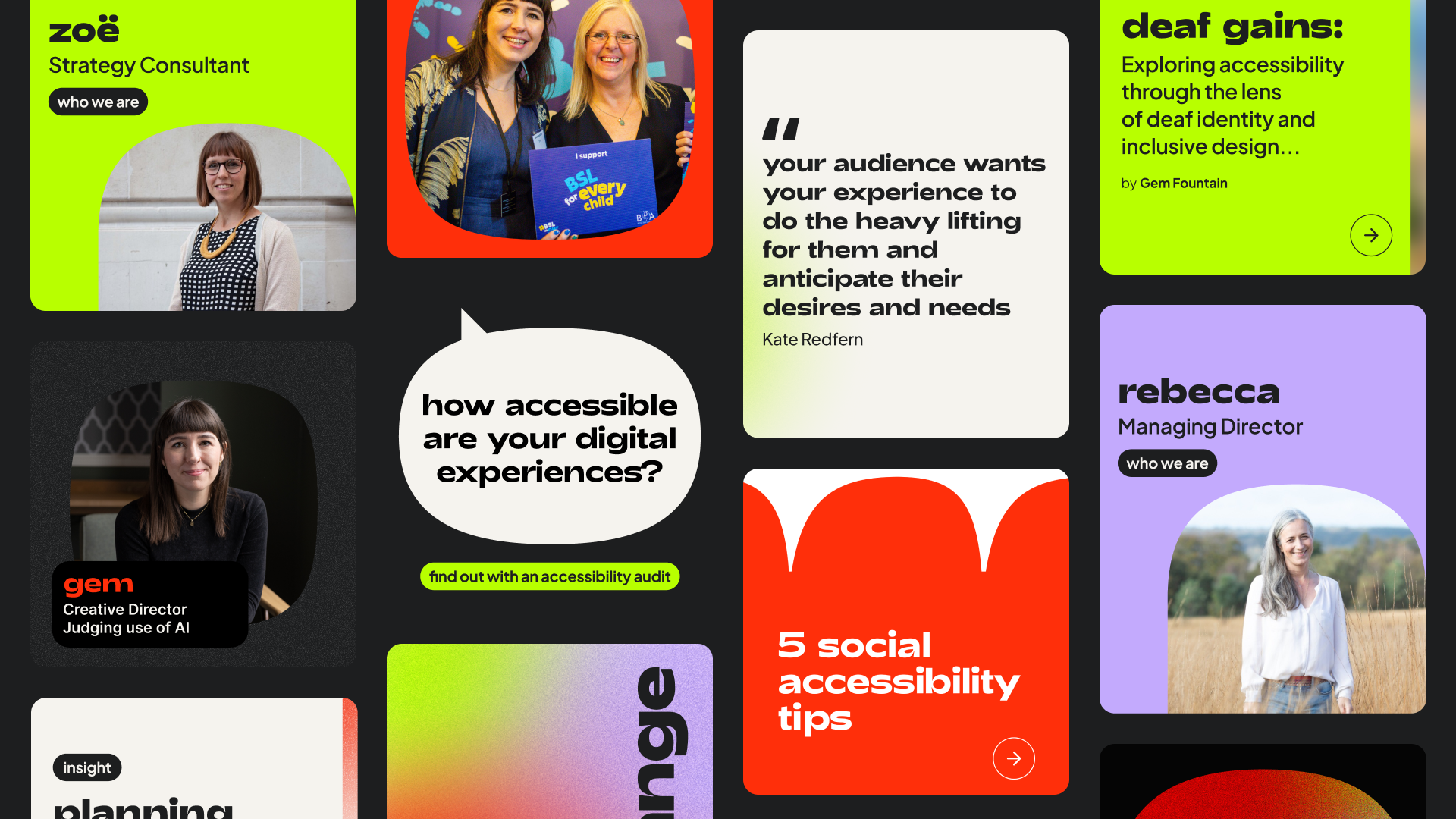
Some of the social media assets that have been enabled by the social media template kit I developed.


